 Optical Wonderful
"The Dress" (Blue/Black vs White/Gold)
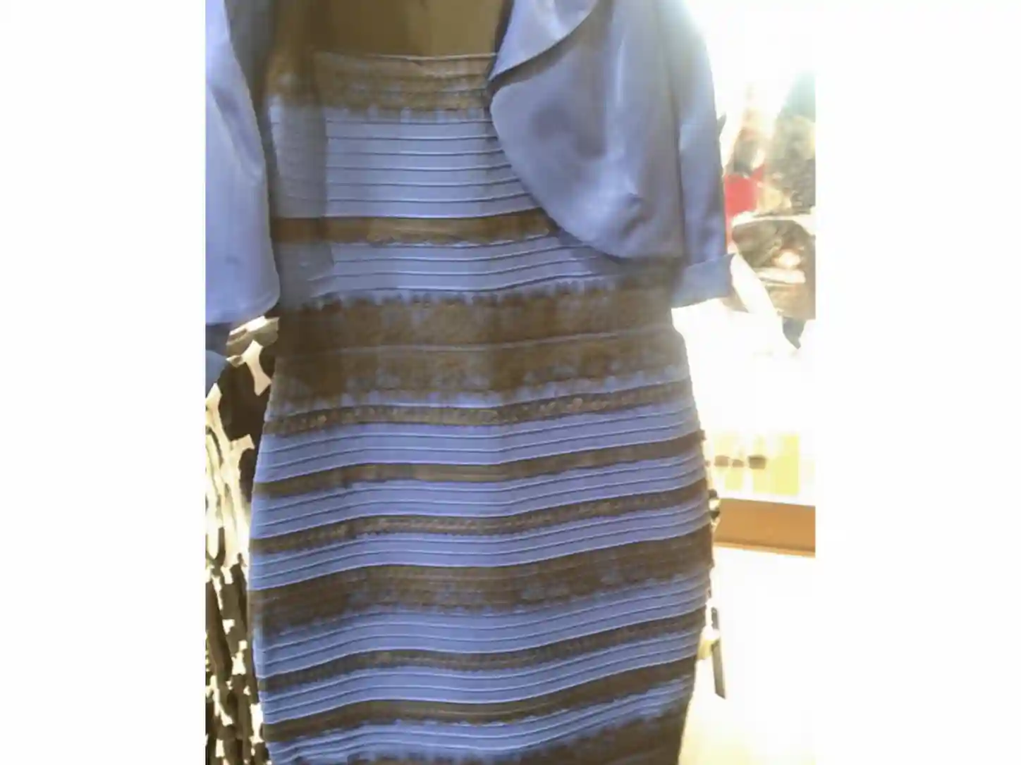
A single photograph of a striped dress split the internet in 2015 between people who saw it as white and gold and people who saw it as blue and black, both looking at the identical pixels.
What you're seeing
A photograph of a lace-trimmed dress, shot in mixed and somewhat washed-out lighting, shows a garment that different viewers describe in two flatly contradictory ways: some see it clearly as white fabric with gold lace trim, others see it just as clearly as blue fabric with black lace trim. This isn't a case of one group being careless or the other imagining things - measured against a color reference, the actual garment (and, separately, the pixel values in the photograph) is blue and black. Yet a large share of viewers, often close to half in early informal surveys, reported seeing white and gold with total confidence, and many people find they simply cannot force themselves to see the other version even when told the "correct" answer.
Why color constancy is the real culprit
The explanation vision scientists converged on centers on color constancy - the same general brain function responsible for the checker shadow illusion and simultaneous contrast. Your visual system doesn't just register the wavelength of light hitting your retina; it tries to factor out the color of the ambient illumination to estimate a surface's true underlying color, the same way it factors out shadow to judge true lightness. The dress photograph is unusually good at short-circuiting that process because it's badly overexposed and gives almost no reliable cues about what kind of light it was shot under. Was it lit by cool, bluish daylight, or by warmer artificial light? The image doesn't clearly say - and depending on which assumption your visual system makes without your awareness, it "corrects" the ambiguous color information in opposite directions. Assume the dress was lit by strong blue-toned daylight, and your brain discounts the blue in the image, leaving the fabric reading as white and the trim as gold. Assume warmer, yellowish light instead, and the correction runs the other way, leaving the fabric reading as blue and the trim as black.
Why people split so consistently
Researchers who studied the phenomenon in the months after it went viral - including work associated with neuroscientist Bevil Conway and colleagues - found that the split correlated with individual differences in assumptions about lighting and, to some degree, factors like age and typical daily light exposure, such as whether someone tends to be awake and active mostly under natural daylight versus mostly under artificial light. No single factor fully explains the roughly two-way split, and it isn't a simple matter of "good eyes" versus "bad eyes" - people with entirely normal color vision land on both sides. What made the photo so effective as an illusion wasn't any special trick built into it deliberately; it was an accidental, close-to-perfect ambiguity in exactly the piece of information - the color of the ambient light - that your visual system quietly guesses at constantly and almost always gets away with guessing without you ever noticing.
Can you switch which version you see?
Many people report being able to flip their perception with effort, similar to a bistable image like the Necker cube, especially after seeing a color-corrected or cropped version of the photo that supplies clearer lighting cues. Viewing the image very small, very large, on a dim screen, or next to a strongly color-cast border can all nudge which assumption about illumination your brain defaults to. Some viewers, though, report never being able to see it any way but their original impression, no matter how the image is presented to them.
A little history
The photograph was taken by Cecilia Bleasdale in Colonsay, Scotland, ahead of her daughter's wedding, after friends and family disagreed sharply about its colors. A friend of the couple posted it online in February 2015, and it spread within hours into one of the fastest, largest-scale viral debates the internet has produced, drawing commentary from celebrities, news outlets, and vision scientists within a single day, and it remains one of the most-cited real-world examples of individual variation in color perception.
Related reading
The dress relies on the same illumination-guessing machinery behind the checker shadow illusion and simultaneous contrast - it's simply the rare case where that guesswork produced two roughly equally popular, mutually exclusive answers instead of one nearly universal one.