 Optical Wonderful
Negative Afterimage (Stare-and-Shift Illusion)
Stare at a saturated color for twenty seconds, shift your eyes to a blank surface, and a ghost image appears in the exact opposite color - a direct look at photoreceptor fatigue.
Fix your eyes on the small black dot at the center of the cyan circle, then press start. Keep your gaze steady until the timer ends.
What you're seeing
Stare fixedly at a strongly colored shape for fifteen to twenty seconds without letting your eyes wander, then immediately shift your gaze to a plain white or gray surface. For a few seconds, a faint but unmistakable copy of the shape reappears - floating on the blank surface, holding roughly the same size and outline, but rendered in a completely different color from the one you were just looking at. Stare at cyan, and the ghost image on the blank page looks reddish. Stare at yellow, and the afterimage looks blue. Stare at black, and it looks white.
This is a negative afterimage, and unlike most of the illusions on this site, it isn't a trick of interpretation - it's a trick of exhaustion. Something in your eye has genuinely, physically changed over those twenty seconds, and the ghost image is the readout of that change.
Try it with the timer above: fix your eyes on the small black dot at the center of the cyan circle, hold your gaze steady for the full count, then look at the blank square that replaces it. Keep your eyes still and the afterimage will hover for several seconds before fading.
Why it happens
Color vision starts with three types of cone photoreceptors in your retina, each tuned to a different range of wavelengths - roughly short (blue-ish), medium (green-ish), and long (red-ish) light. When you stare at a saturated cyan patch, the cones responding to blue and green light fire continuously for an extended period, and like any biological cell driven hard for that long, they start to fatigue. Their sensitivity temporarily drops, a process called photoreceptor adaptation or pigment bleaching, referring to the photopigment molecules inside the cones that get chemically depleted by sustained light exposure and take a little time to regenerate.
The moment you shift your gaze to a blank white surface - which reflects all wavelengths of light roughly evenly - every cone in that patch of retina should, in principle, fire about equally, since white light stimulates all three cone types together. But the cones that were just staring at cyan are worn out and under-respond, while the cones that were being ignored (the ones tuned to red) are fresh and fire at full strength. The result is a brief, localized imbalance: your visual system reads that patch of the blank page as tinted toward red, simply because red-sensitive cones are, relatively speaking, shouting louder than their fatigued neighbors.
This process is sharpened further by opponent-process color coding, the way your visual system wires cone signals together downstream of the retina. Rather than treating red, green, and blue as three independent channels, the brain recodes them into two opposing pairs: a red-versus-green channel and a blue-versus-yellow channel (with a separate black-versus-white channel for brightness). Fatiguing the "cyan-favoring" side of these channels doesn't just weaken cyan - it actively pushes the balance toward the opposing color, red. That's why the afterimage isn't a washed-out version of what you stared at; it's a vivid swing to the specific complementary color on the opposite side of the same neural channel. It's the same opponent circuitry that makes it impossible to picture a "reddish green" - the two sides of each channel are built to compete, not blend.
The effect only shows up clearly against a neutral surface because a colored or patterned surface floods the same cones with new, strong signals that overwhelm the small fatigue-driven imbalance. A blank wall or plain sheet of paper gives the tired cones a fair, quiet test - which is exactly why the demo above asks you to look at an empty square rather than another picture.
A little history
Observations of afterimages go back at least to antiquity - Aristotle noted that staring at the sun and looking away left colored spots in the visual field. The phenomenon was studied more systematically starting in the early 19th century, notably by the poet and naturalist Johann Wolfgang von Goethe, whose 1810 Theory of Colours devoted considerable attention to "physiological colours," including detailed descriptions of negative afterimages produced by staring at colored panels. The modern explanation had to wait for Ewald Hering, a German physiologist who proposed opponent-process color theory in 1878 to account for exactly this kind of complementary-color reversal, decades before anyone understood the biochemistry of cone photopigments. Hering's theory was largely vindicated in the 20th century once researchers such as Leo Hurvich and Dorothea Jameson worked out the psychophysics of opponent color channels in the 1950s, and later neuroscience confirmed opponent-coded cells in the retina and thalamus.
Related reading
Negative afterimages are one of the clearest demonstrations that color is something your visual system actively computes rather than passively records - the same theme runs through the simultaneous contrast illusion and the notorious "dress" illusion elsewhere in this library, both of which involve the brain making assumptions about color that don't match the raw light hitting your eyes. For a color illusion you can check against the raw pixels rather than raw light, see the checker shadow illusion.
Read the science behind why this happens →
Related illusions
Simultaneous Contrast Illusion
Two identical gray squares look like different shades the instant you place one on a dark background and the other on a light one - proof that the brain never judges color in isolation.
 Color & Contrast
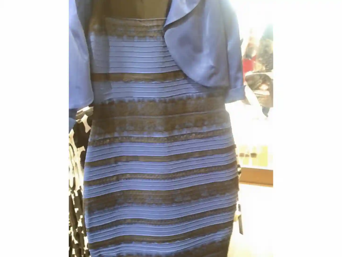
"The Dress" (Blue/Black vs White/Gold)
A single photograph of a striped dress split the internet in 2015 between people who saw it as white and gold and people who saw it as blue and black, both looking at the identical pixels.
Color & ContrastChecker Shadow Illusion
Two squares on a checkerboard, one inside a cast shadow and one outside it, are rendered in the exact same shade of gray - yet almost nobody can see that without proof.