 Optical Wonderful
Chromostereopsis (Color Depth Illusion)
Flat patches of saturated red and blue, printed at the exact same distance from your eye, can appear to float at different depths purely because of how your eye focuses different wavelengths of light.
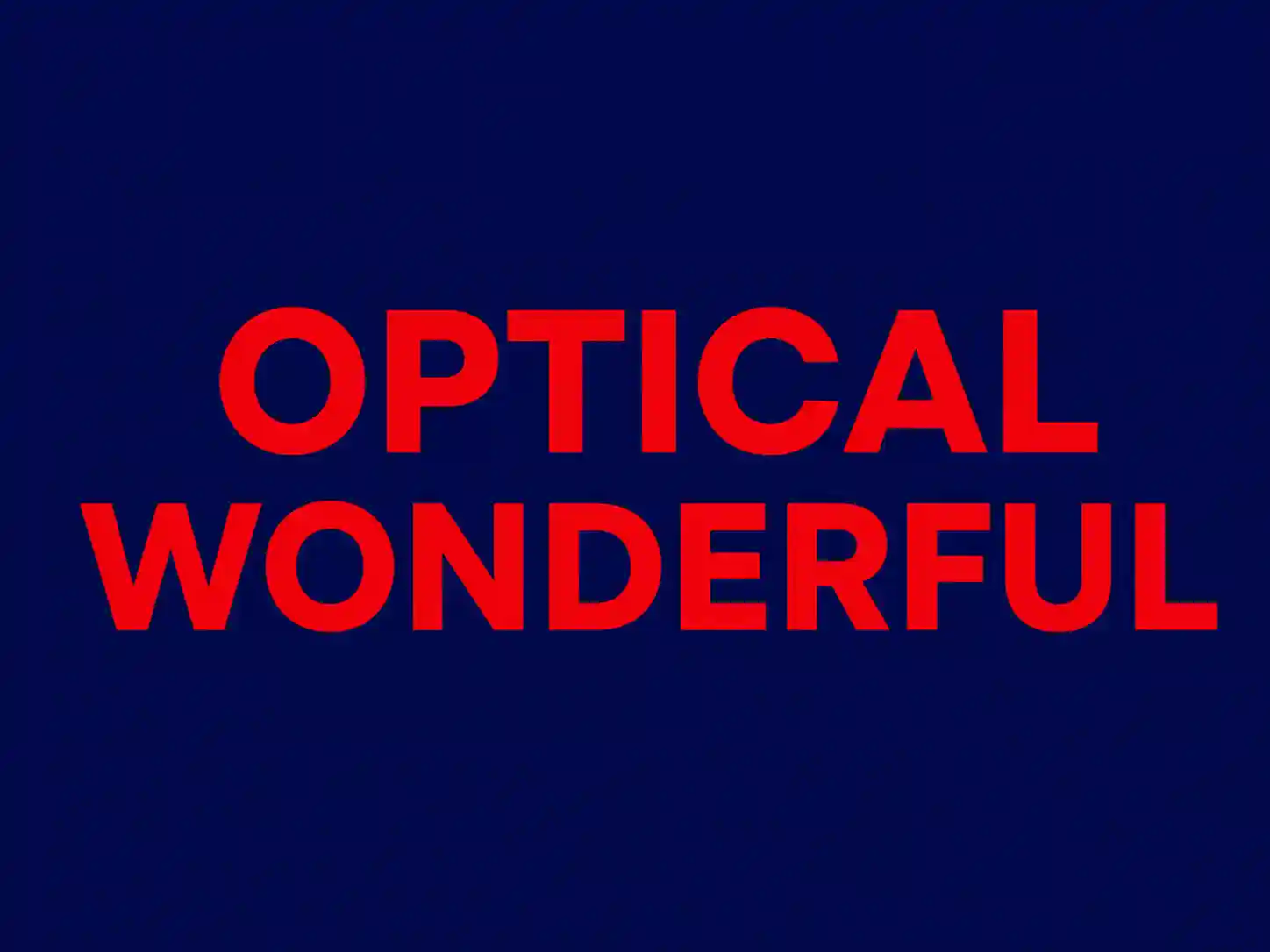
What you're seeing
A simple pattern of solid color blocks or text - commonly pure red shapes against a pure blue or black background - printed or displayed perfectly flat, on a single plane, with no shading, no perspective cues, and no binocular trickery of the kind used in autostereograms. And yet, for many viewers, the red regions appear to float slightly forward of the blue regions, hovering a small but distinct amount closer to the eye, even though every pixel is printed at exactly the same physical depth. Some people get the reverse effect, with blue appearing to advance and red to recede; a minority perceive no depth separation at all. The effect tends to be strongest with highly saturated red against highly saturated blue or violet, and it gets noticeably stronger in dim lighting, when your pupils are more dilated.
Why it happens
Unlike most of the illusions in this collection, chromostereopsis isn't primarily a story about how your brain interprets an image - it's largely a story about basic eye optics, happening before the signal even reaches your visual cortex. The lens of your eye doesn't focus every wavelength of light at exactly the same point; this is called chromatic aberration, and it's the same optical phenomenon that makes cheap camera lenses produce faint color fringing around high-contrast edges. Longer wavelengths (toward red) and shorter wavelengths (toward blue) refract slightly differently as they pass through your cornea and lens, so they don't converge to a perfectly identical focal point on your retina.
That difference alone wouldn't necessarily produce a depth illusion - it could just as easily show up as mild blur. What turns it into an apparent depth difference is the combination of chromatic aberration with the off-center position of your eye's pupil relative to its optical axis, plus small differences in exactly where red versus blue light lands on the retina between your two eyes. That mismatch produces a tiny positional offset between the red and blue images on your retina that closely resembles the kind of offset your brain normally interprets as binocular disparity - the same depth cue that makes near objects and far objects look different between your two eyes. Your visual system, reading that color-driven positional offset the way it would read a genuine depth cue, assigns the red and blue regions to slightly different distances, even though nothing about the actual printed image has any depth information in it at all.
Why it varies so much between people and conditions
Because the effect depends on fine details of eye optics - pupil size, exact lens shape, and the precise position of the pupil relative to the eye's optical axis - it varies substantially from person to person, and even somewhat between someone's two eyes. Dim lighting reliably strengthens the effect for most people because a dilated pupil admits light across a wider area of the lens, amplifying the aberration-driven offset; strong ambient light constricts the pupil and can weaken or eliminate the effect almost entirely. This variability is also why chromostereopsis has practical relevance well outside vision-science labs: exit signage, safety markings, and some accessibility-related color guidelines take it into account, since certain red/blue color combinations can produce a distracting, slightly uncomfortable "floating" sensation in printed or lit signage that designers generally want to avoid.
A little history
Observations of red and blue appearing to sit at different depths trace back to at least the late nineteenth century, with German physiologist Ernst Brücke among the earliest to document the effect systematically, around 1878, as part of broader nineteenth-century interest in the physiology of color vision. Because the mechanism sits at the intersection of basic optics and depth perception, chromostereopsis has remained a recurring research subject for both ophthalmologists studying chromatic aberration directly and vision scientists using it as a tool to probe how the brain weighs and interprets depth cues that weren't actually put there on purpose.
Related reading
Chromostereopsis produces manufactured depth through optics rather than through pattern design, which makes a useful contrast with autostereograms and anamorphic art, both of which rely on deliberate image construction instead. Its dependence on individual differences in color and depth perception also connects it to the dress illusion, another case where the same physical stimulus produces genuinely different perceptual reports across viewers.
Read the science behind why this happens →
Related illusions
 Depth
Depth
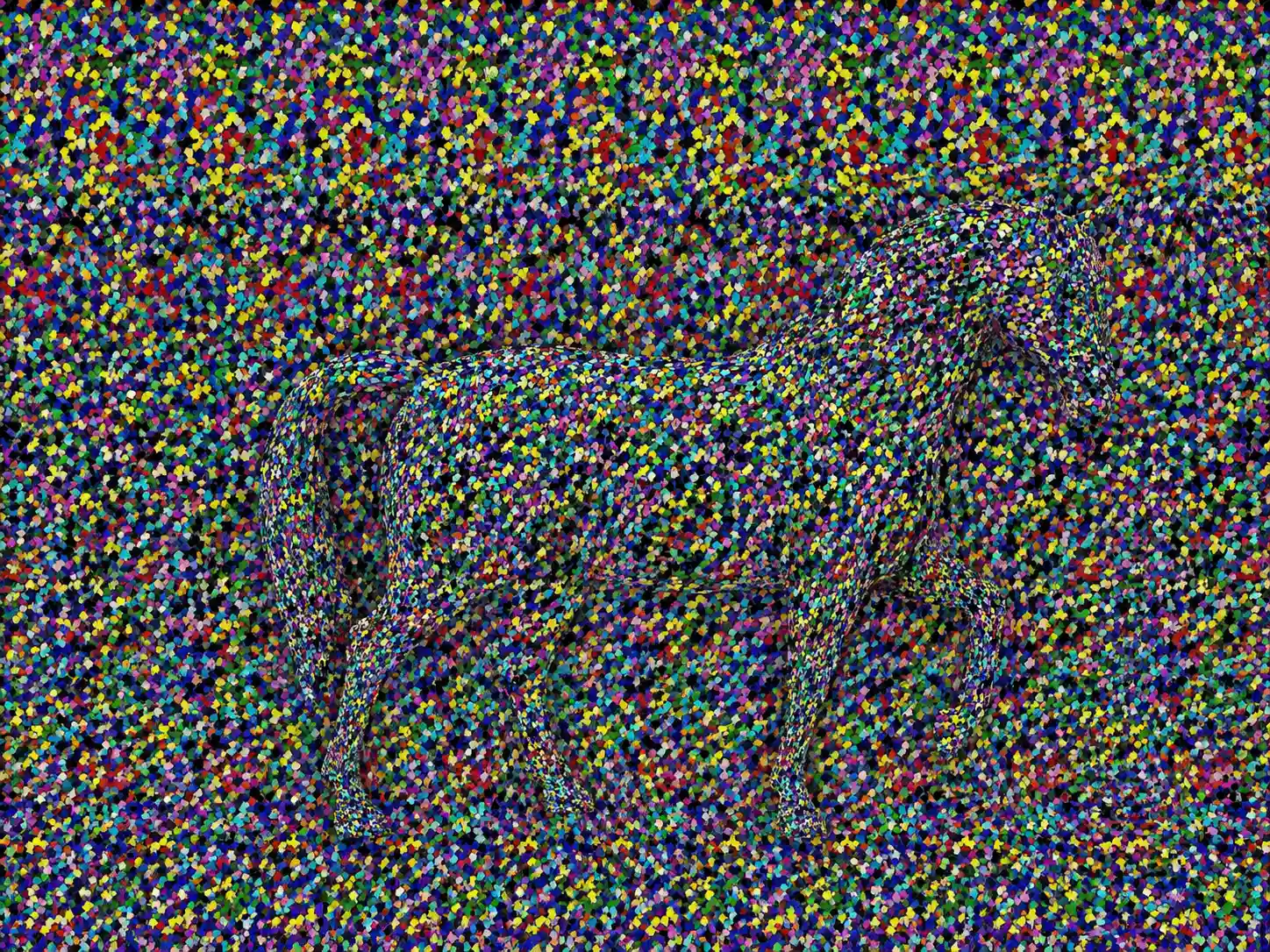
Autostereograms ("Magic Eye" Images)
A flat pattern of repeating texture that, viewed with deliberately unfocused or crossed eyes, suddenly resolves into a hidden 3D shape floating above or below the page.
 Depth
Depth
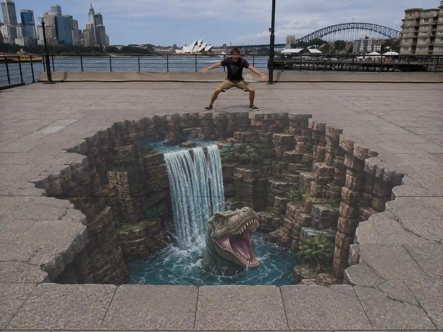
Anamorphic Chalk and Street Art Illusions
Street and chalk paintings drawn as heavily stretched, warped shapes that only resolve into a convincing 3D scene when viewed from one specific, carefully calculated angle.
 Color & Contrast
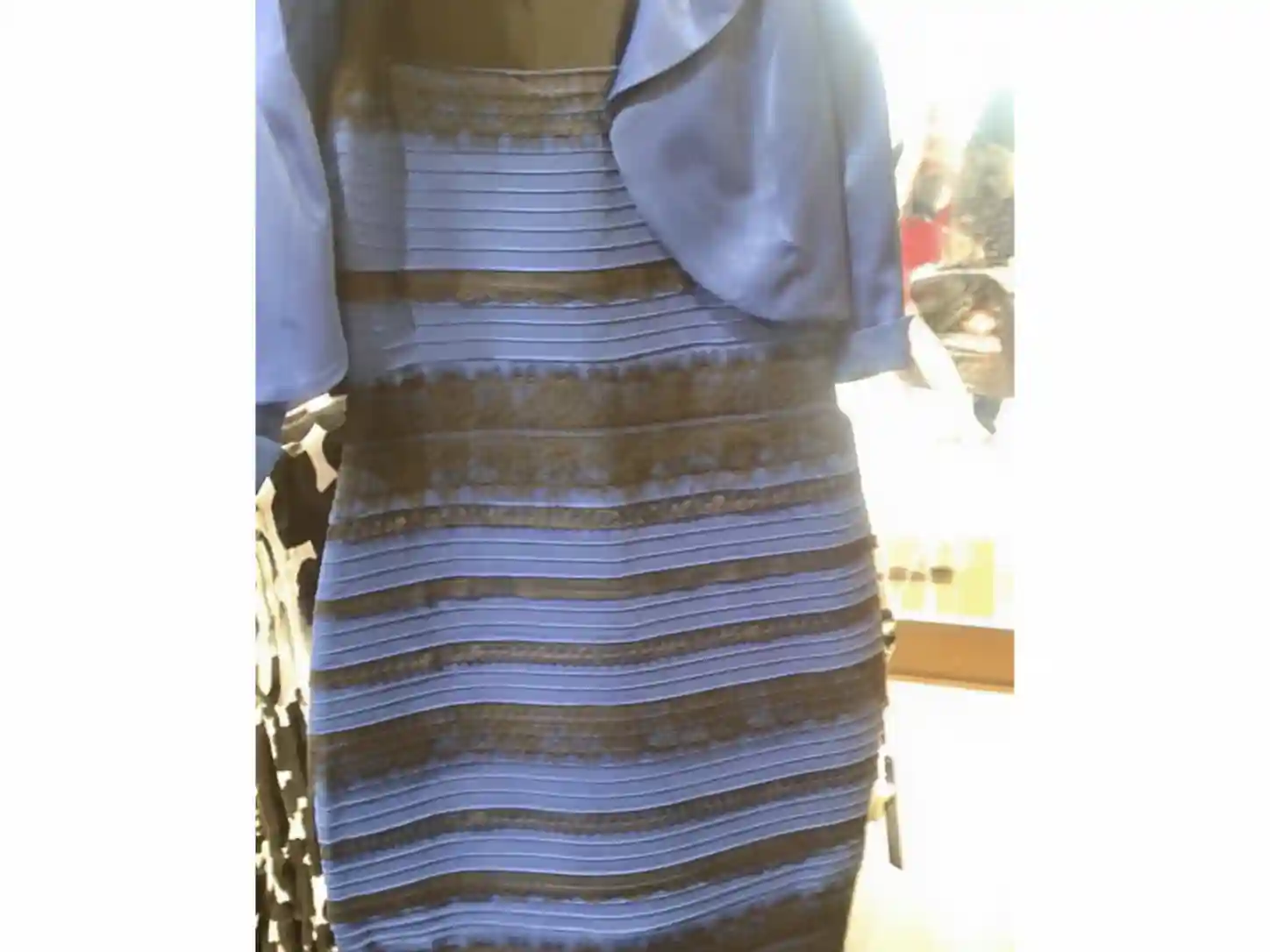
"The Dress" (Blue/Black vs White/Gold)
A single photograph of a striped dress split the internet in 2015 between people who saw it as white and gold and people who saw it as blue and black, both looking at the identical pixels.